QR Code Design Principles
Master Visual Hierarchy & Brand Integration
Learn the fundamental design principles that make QR codes both beautiful and functional. From contrast and readability to brand integration, discover how to create QR codes that enhance your design while maintaining optimal scanability.
Core Design Principles
These fundamental principles form the foundation of effective QR code design, ensuring both visual appeal and functional excellence.
Contrast & Readability
Ensure maximum scanability with proper contrast ratios and clear visual separation.
- Maintain minimum 3:1 contrast ratio between QR code and background
- Use dark colors on light backgrounds or vice versa
- Avoid similar color values that reduce readability
- Test contrast in different lighting conditions
Visual Hierarchy
Create clear information hierarchy that guides user attention effectively.
- Make QR code the focal point of your design
- Use size and positioning to establish importance
- Balance QR code with supporting text and graphics
- Ensure call-to-action is clearly visible
Layout & Composition
Apply fundamental design principles for balanced and effective layouts.
- Follow rule of thirds for optimal positioning
- Maintain adequate white space around QR code
- Align elements consistently throughout design
- Create visual flow that leads to the QR code
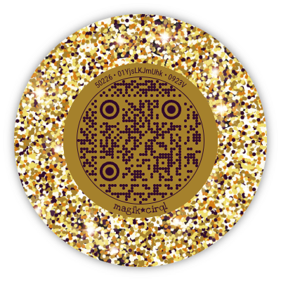
Brand Integration
Seamlessly incorporate QR codes into your brand identity and visual style.
- Use brand colors while maintaining contrast
- Match typography and design style
- Incorporate brand elements without obscuring QR code
- Maintain brand consistency across all materials
Contrast & Readability Examples
See how different contrast levels affect QR code scanability and choose the right approach for your design needs.

Excellent Contrast
PerfectBlack QR code on white background provides maximum readability

Good Contrast
GoodDark blue on light background maintains good scanability
Acceptable Contrast
AcceptableColored QR codes can work with proper contrast management

Poor Contrast
AvoidSimilar color values make scanning difficult or impossible
Brand Integration Strategies
Learn how to seamlessly incorporate QR codes into your brand identity while maintaining optimal functionality and visual appeal.
Color Strategy
Use brand colors strategically while maintaining scanability
- Apply brand colors to backgrounds and frames
- Keep QR code itself high contrast
- Use brand colors in supporting elements
- Test brand color combinations thoroughly
Typography Integration
Harmonize text elements with your brand typography
- Use brand fonts for call-to-action text
- Maintain consistent font hierarchy
- Balance text size with QR code prominence
- Ensure text complements rather than competes
Visual Elements
Incorporate brand graphics and design elements effectively
- Add subtle brand patterns to backgrounds
- Use brand icons and graphics as accents
- Maintain visual consistency with other materials
- Avoid overwhelming the QR code with decoration
Essential Design Guidelines
Design Do's
- Maintain Visual Balance: Ensure QR code doesn't overwhelm other design elements
- Use Consistent Styling: Match QR code design with overall aesthetic
- Test Across Devices: Verify appearance on different screens and print media
- Consider Context: Design for the environment where QR code will be used
Design Don'ts
- Avoid Low Contrast: Don't use similar colors that reduce scanability
- Don't Overcomplicate: Avoid busy backgrounds that interfere with scanning
- Skip Brand Guidelines: Don't ignore brand consistency for QR code design
- Forget Accessibility: Don't overlook color-blind and visually impaired users
Start Designing with Principles
Ready to apply these design principles? Create beautiful, functional QR codes that perfectly integrate with your brand and design vision.
Plan Your Design
Consider your brand, context, and user needs before starting.
Apply Principles
Use contrast, hierarchy, and brand integration guidelines.
Test & Refine
Test scanability and visual appeal across different scenarios.