QR Code Color Usage
Master Contrast, Accessibility & Visual Appeal
Discover the science of color in QR code design. Learn how to create visually stunning QR codes that maintain perfect scanability while meeting accessibility standards and enhancing your brand identity.
Color Design Principles
Master these fundamental color principles to create QR codes that are both beautiful and functional across all use cases and user needs.
Contrast Requirements
Ensure sufficient contrast between QR code and background for reliable scanning.
- Maintain minimum 3:1 contrast ratio for basic readability
- Aim for 4.5:1 contrast ratio for enhanced accessibility
- Use dark foreground on light background or vice versa
- Test contrast in various lighting conditions
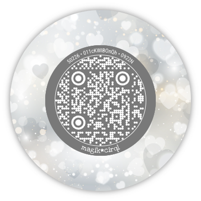
Accessibility Standards
Design QR codes that work for users with visual impairments and color blindness.
- Avoid red-green color combinations
- Don't rely solely on color to convey information
- Ensure sufficient luminance difference
- Test with color blindness simulators
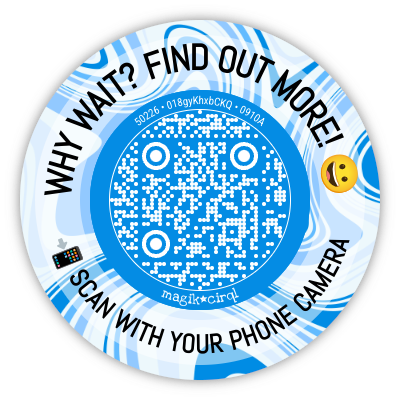
Brand Color Integration
Incorporate brand colors while maintaining scanability and visual appeal.
- Use brand colors in backgrounds and frames
- Keep QR code pattern high contrast
- Apply brand colors to supporting elements
- Maintain brand consistency across materials
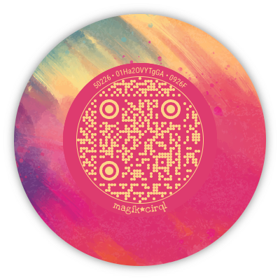
Visual Impact
Create visually appealing QR codes that attract attention and encourage scanning.
- Use colors that complement your design
- Consider psychological impact of colors
- Balance visual appeal with functionality
- Ensure colors work in target environment
Contrast Examples & Ratings
See how different color combinations affect contrast ratios and accessibility compliance for QR code design.

Perfect Contrast
AAABlack on White
Maximum contrast ensures perfect scanability
High Contrast
AAADark Blue on Light Gray
Strong contrast with subtle color variation
Good Contrast
AADark Green on White
Meets accessibility standards with brand colors
Poor Contrast
FailLight Gray on White
Insufficient contrast causes scanning issues
Color Strategy Approaches
Choose the right color strategy for your QR code based on your brand, audience, and design goals.
Monochromatic
Use different shades of the same color
Pros:
- Cohesive appearance
- Easy to implement
- Brand consistency
Cons:
- Limited visual variety
- Contrast challenges
Best For:
Professional, minimalist designs
Example: Dark blue QR on light blue background
Complementary
Use colors opposite on the color wheel
Pros:
- High visual impact
- Natural contrast
- Eye-catching
Cons:
- Can be overwhelming
- Accessibility concerns
Best For:
Marketing materials, attention-grabbing designs
Example: Blue QR on orange background
Neutral Base
Use neutral colors with accent highlights
Pros:
- Versatile
- Professional
- High contrast
Cons:
- Less distinctive
- May appear bland
Best For:
Business applications, formal documents
Example: Black QR on white with colored frame
Brand Adaptive
Adapt brand colors to maintain contrast
Pros:
- Brand consistency
- Recognizable
- Professional
Cons:
- May require color modification
- Limited flexibility
Best For:
Corporate materials, brand campaigns
Example: Brand color QR with adjusted contrast
Accessibility Considerations
Design inclusive QR codes that work for users with various visual impairments and accessibility needs.
Color Blindness
8% of men, 0.5% of women
Considerations:
- Avoid red-green combinations
- Use blue-yellow alternatives carefully
- Rely on contrast, not just color
- Test with color blindness simulators
Solution:
Use high contrast and avoid problematic color pairs
Low Vision
3.2% of population
Considerations:
- Increase contrast ratios
- Use larger QR codes
- Avoid complex backgrounds
- Ensure clear edges
Solution:
Maximize contrast and minimize visual noise
Aging Eyes
25% of adults over 65
Considerations:
- Reduced contrast sensitivity
- Difficulty with blue colors
- Need for higher illumination
- Slower visual processing
Solution:
Use high contrast and avoid blue-heavy designs
Color Testing Methods
Use these testing methods to validate your color choices and ensure optimal performance across all scenarios.
Contrast Checker
Measure contrast ratios
Online tools or browser extensions
Target: Minimum 4.5:1 ratio
Color Blindness Simulator
Test accessibility
Simulate different types of color blindness
Target: Readable in all simulations
Device Testing
Real-world validation
Test on various devices and lighting
Target: Consistent scanning performance
Print Testing
Physical media validation
Print and scan under different conditions
Target: Reliable scanning when printed
Quick Color Tips
Color Do's
- Test Contrast Ratios: Always verify contrast meets accessibility standards
- Consider Context: Choose colors appropriate for the environment
- Use Brand Colors Wisely: Integrate brand colors without compromising function
- Test Across Devices: Verify colors appear correctly on different screens
Color Don'ts
- Avoid Low Contrast: Don't use similar colors that reduce readability
- Skip Accessibility Testing: Don't ignore color blindness considerations
- Rely Only on Color: Don't use color as the sole way to convey information
- Ignore Print Differences: Don't assume screen colors will print the same
Start Using Color Effectively
Ready to create colorful, accessible QR codes? Apply these color principles to enhance your designs while maintaining perfect functionality.
Choose Your Strategy
Select a color approach that fits your brand and goals.
Test Contrast
Verify contrast ratios meet accessibility standards.
Validate & Refine
Test across devices and accessibility scenarios.